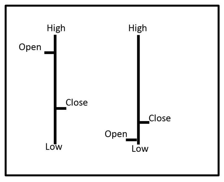
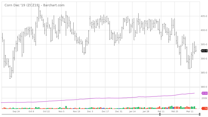
A new series of articles — Charting Commodities — is going to cover the basics of some of the more common indicators used in technical analysis. Many types of charts are used to track market movement. For the purpose of this series I want to define two of them: the open-high-low-close (OHLC) bar chart and the candlestick chart.


OHLC Bar Chart
The OHLC bar chart is the common charting method used in western market analysis. The OHLC stands for open, high, low, and close. Each vertical line on the chart represents the high and low for the given trading period. These trading periods can be for minutes, hours, days, weeks, or months. It is important to know the time period of the chart you are looking at. On each vertical line there will be a dash to the left and a dash to the right. The dash to the left indicates where the price opened for the trading period. The dash to the right indicates where the price closed for the trading period.


Candlestick Chart
Candlestick, or Japanese candlestick, charting is a lesser used charting method. When reading a candlestick chart there are a few things to keep in mind. There are three parts to any candlestick. The first part to note is the real body. That is the box/rectangle part of the line. The real body represents the open and close of the trading period. If the close is higher than the open, the real body will be white or red. If the open is higher than the close, the real body will be black or green. To drive home the idea, if the candle’s real body is white/green the market is bullish, increasing prices. If the candle’s real body is black/red the market is bearish, decreasing prices.
The next part to notice is what is called the upper shadow. This is the line above the real body, and represents the high for the trading period. The final part is the lower shadow, which, is the line below the real body. The lower shadow shows the low for the trading period. If you were looking at a weekly candlestick chart, the open would be the opening price on Monday, the weekly high-low range, and then Friday’s close.
Selecting the Best Format for You
Neither charting method is inherently better than the other. There are some specific patterns used with candlestick charts that will be covered later in this series. The important feature of any chart is usability by the end user. If you can follow and understand OHLC bar charts, but struggle remembering what the white body of a candlestick line represents, use the OHLC bar chart. Most commodity websites will have an option to select how you want the chart to be displayed.

